

translation: There are people conjuring thoughts like “I’ve seen one too many brown people”.
Also unsurprising where the sentiment is coming from:
srcs:
- https://www.ipsos.com/en/perils/perils-perception-prejudice-and-conspiracy-theories-0
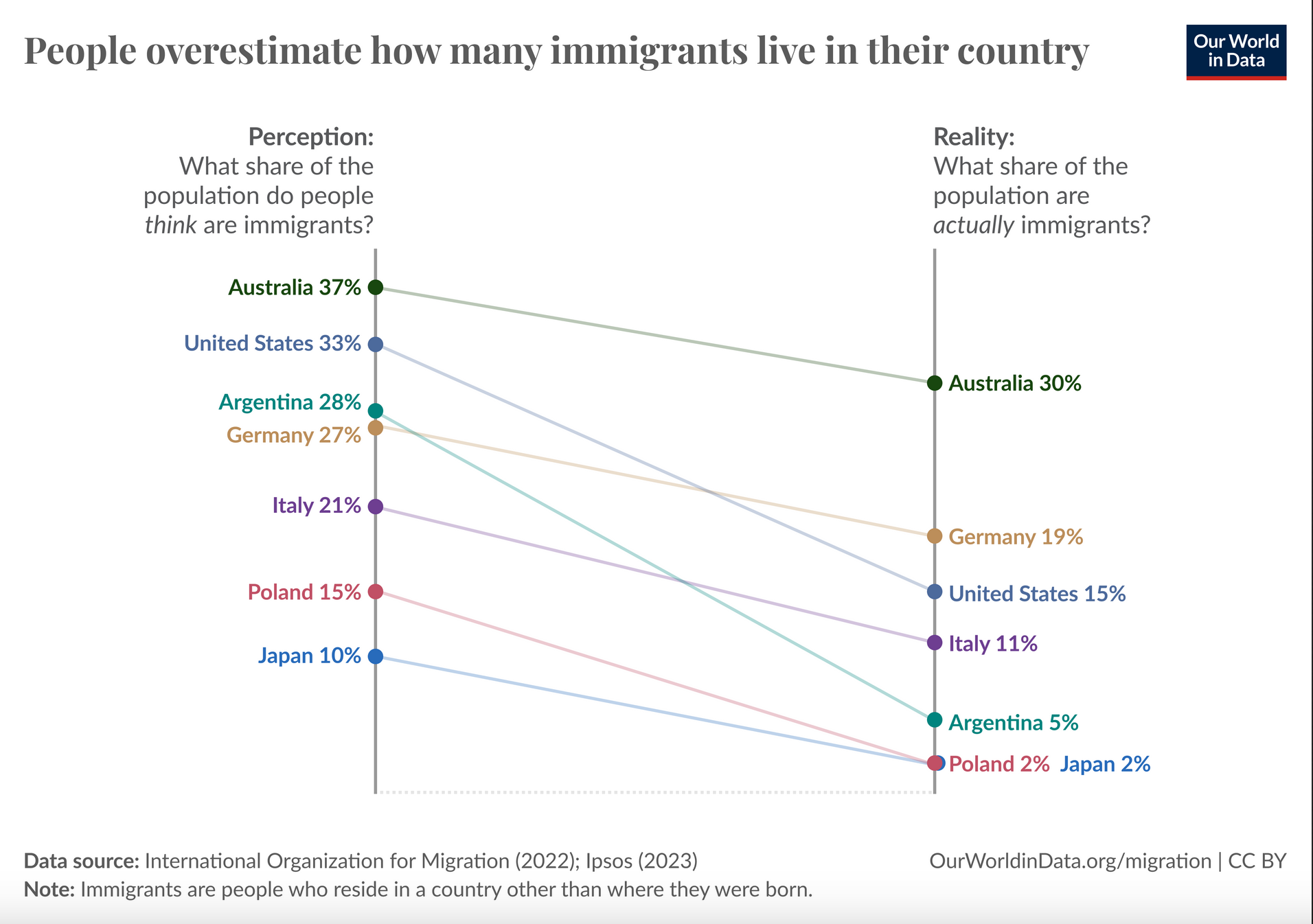
- https://ourworldindata.org/data-insights/many-people-overestimate-the-percentage-of-immigrants-in-their-country
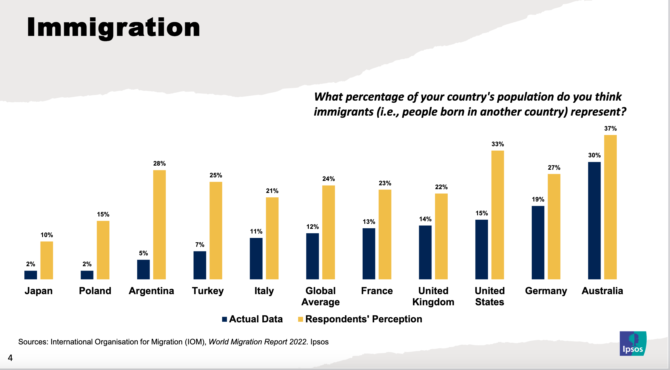
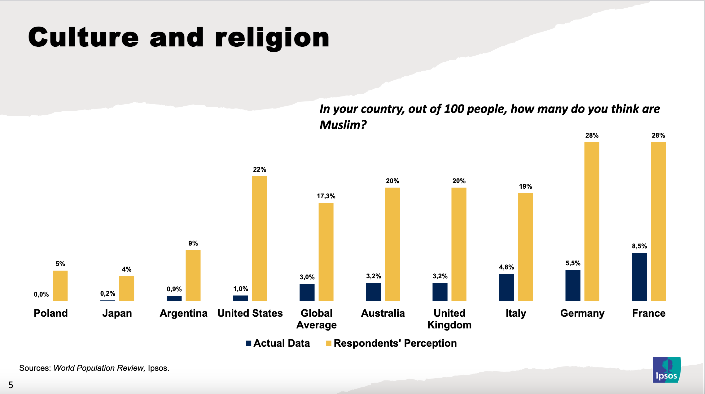
More imbecility (from the same src):
The “what percentage do you think” vs “what percentage are” would be much better either as a scatterplot with a y=x line, or as a ratio (think/are) vs actual percent
Here’s a rough plot of the second thing. There’s a number of issues with it but I think it more clearly conveys the crucial information
The first plot might arguably be better but you couldn’t really see the way the ratio of overestimation decreased with more immigration as clearly as this one.
edit: Damn that came out way smaller than I expected. It’s readable if you zoom in