
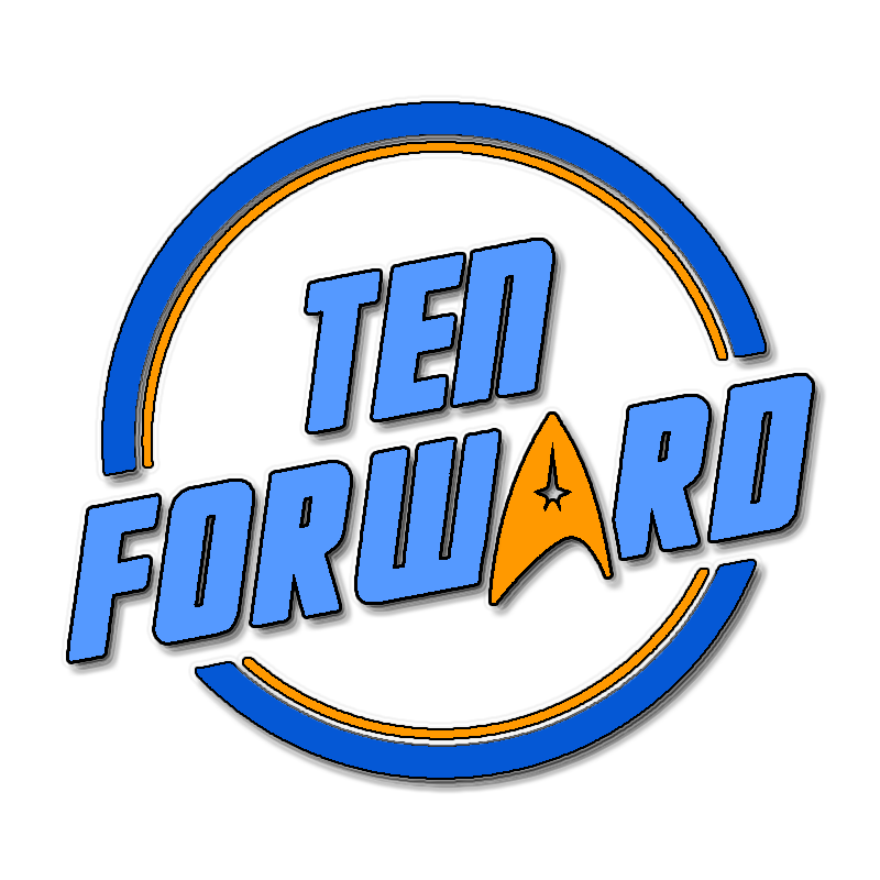
Is it just me or is the K upside down? Surely this looks better?


Is it just me or is the K upside down? Surely this looks better?

It’s okay to like them while they do good and then change your mind when they turn evil.


The enshittification cycle:
Phase one, attract users by providing a good service.
Phase two, once the users are locked in, squeeze them for all they’re worth by selling them to business customers (advertisers and/or data buyers).
Phase three, once the business customers are locked in, squeeze them for all they’re worth by threatening to deny them access to the users on whom they now depend.
Spez seems to think Reddit has the pull to make phase 3 happen. I rather doubt it, but we’ll see.


It does make a certain amount of sense. Big profit now means you get a chunk of cash to invest in other quick profit schemes, and your wealth just keeps snowballing. It works as long as you don’t care that you never build anything that lasts.


It’s phase three of the enshittification cycle. In phase one, you attract users by providing a good service. Once they’re locked in, you squeeze them for all they’re worth by switching focus to business customers. Once they’re locked in, you squeeze them by threatening to deny them access to the users on whom they now depend.


I don’t see why the shareholders wouldn’t want his head on a pike as well.
I know that, but it just looks weird. Though on second thought, maybe the issue is the connection between E and K. Star Wars has the R and S connected, but there it looks like a natural extension of the strokes made when writing the letters. Here it doesn’t work nearly as well, and the second line already has two connected letters with T and R anyway. So after thinking about it a bit more, I think I’d just cut the connection between E and K. The K still looks a little odd, but it conforms to the SW logo, and at least the entire bottom right corner doesn’t stick out like a sore thumb.