• 3 Posts
  • 47 Comments
Joined 1 year ago
cake
Cake day: July 22nd, 2023

help-circle

  • fool@programming.devtoSelfhosted@lemmy.worldhow much power does your system need?
    link
    fedilink
    English
    arrow-up
    31
    arrow-down
    3
    ·
    edit-2
    2 days ago

    I forgive 'em cuz watt hours are a disgusting unit in general

    idea what unit
    speed change in position over time meters per second m/s
    acceleration change in speed over time meters per second, per second m/s/s=m/s²
    force acceleration applied to each of unit of mass kg * m/s²
    work acceleration applied along a distance, which transfers energy kg * m/s² * m = kg * m²/s²
    power work over time kg * m² / s³
    energy expenditure power level during units of time (kg * m² / s³) * s = kg * m²/s²

    Work over time, × time, is just work! kWh are just joules (J) with extra steps! Screw kWh, I will die on this hill!!! Raaah



  • Disclosure: I’ve done very little UI/UX.

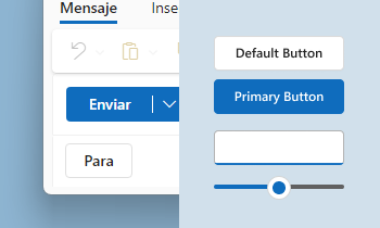
    Google’s Material Design (wikipedia) is much more widely-adopted across OSes/Flutter/the web (see how many websites have that dropshadow topbar and ≡?); Microsoft’s Fluent (wikipedia) is Windows-first, but is usable anywhere.

    Both are based on responding to user actions. Fluent uses lightup acrylic (translucent) canvases (e.g. hover? border glowy.)

    while Google’s Material uses paper-esque whitespace, navbars, dropshadows, and round corners. (e.g. scrolling? dropshadow appears on nav)

    Think Microsoft Teams vs. Google Drive.

    They’re both full-fledged but Material You is way more common judging by places such as the F-Droid ecosystem on Android. As for which is “better”, Material You supposedly has better colorscheme flexibility since it ‘wants’ to adapt to e.g. user wallpapers. But other than that it’s really just preference (or whether relevant tooling exists :P). I know some devs use Material You for a predictable, unified look across Android apps, while others bend them to their will to reduce animations or whatnot.

    If you’re designing something, make sure you keep your own self in the mix too. Breezy Weather uses Material Design, but it’s more customized to have a unique feel than, say, TrackerControl (which also uses Material).


  • Oh my God I LOVE FONTS

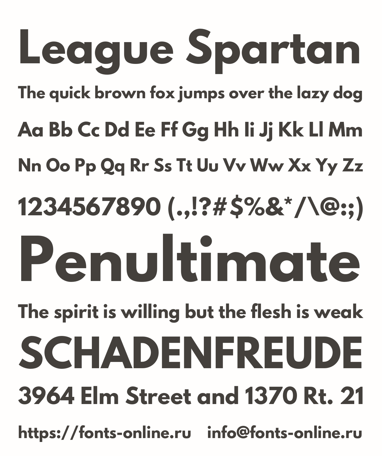
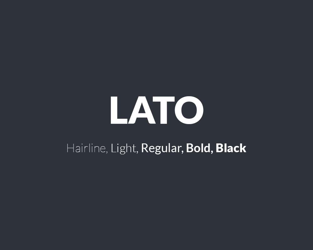
    Spartan is a bit wide for me (see that w?) but Lato with a good colorscheme is always sexy

    Another thing: if you’re familiar with fonts you can have a weird pseudo-Sherlock funtime guessing how something was made.

    points This book is using Georgia instead of Times New Roman. See how the 9 is low? But the page numbers are Times New Roman because the 9 isn’t low. Was paging in the author’s control?

    and

    font with the light blue shading thing. This club recruitment poster was made in Microsoft Word.

    About serif disdain… what about LaTeX’s serif? :}