
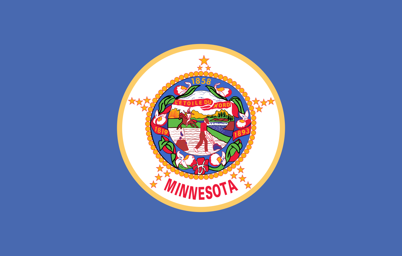
The current flag looks like this, which obviously needs changing:
There is a commission tasked with proposing a new design. A news article about it is available here: https://www.cbsnews.com/minnesota/news/minnesota-house-bill-moves-forward-commission-to-redesign-state-flag-and-seal/
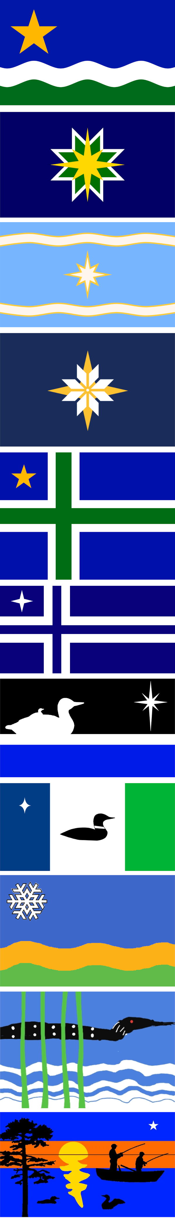
The top proposal, called “The North Star Flag”, seems to be a popular favorite.
I gathered these proposals from these two sites: https://newmnflag.org/designs https://vexillology.fandom.com/wiki/Minnesota
I vote for #10, the 4yr old’s rendition of a Lovecraftian horror.
Minnesotan here. #4 from the top has my vote hands down. Nice clean flag, not too complicated.
Not a Minnesotan but I agree, #4 is the best.
So just the big fancy star? Or the Nordic Cross?
By #4 I mean the yellow and white star that looks like a quilt block.
Got it! Thanks!
Non-minnesotan but I agree on #4 it also allows it to be reproduced on other mediums like buttons and patches easily.
Minnesota native here - definitely agree, that’s a great design. Plenty of potential for it to become an iconic flag.
Those last 5 are absolutely unhinged and I love them. I think that number 4 is really the best choice though
Seriously what are the stories on those? Surely they were submitted by children or something?
Take it from a Coloradan, get yourself a nice, clean flag design and the merch will sell itself.
Needs a loon with red stars for eyes
And an optic blast like the Laser Kiwi Flag.

Here you go!

Yes.
This comment section has gone full !vexillologyjerk and I’m loving it.
This has double the lasers, just to stick it to nz who passed up a great deaign
Every other option is now the wrong option.
Is Minesota trying to become Nordic?
Minnesota does have an unusually large population with Nordic ancestry. I guess that is the reason for the Nordic cross designs
https://en.wikipedia.org/wiki/Nordic_and_Scandinavian_Americans
I cannot see the name Minnesota without hearing the Norwegian family from the start of Deadwood: “We’re going hooome, too Minnesooootaaaahh”
#4 is my choice. Very clean, it’s an easily recognizable design, and it seems more creative than just “Nordic cross with star” or whatever the abominations in the later half are.
The pattern is called Selburose and is a traditional pattern used in knitted mittens and sweaters from the area of Selbu located in Norway at the border to Sweden.
I thing #4 is by far the nicest flag
Number five gets my vote. The light blue with a nice star and the swirls , it’s the perfect sign for a flag
1, 5, 4.
I like Nordic Crosses, and the star’s a good color in a good placement. If you want an snowflake star, 4 is the best version.
But 1 emphasizes the rivers!
Number two or four.
Really disappointed in lack of laser beams coming from the bird eyes.
I like how the farther down you go on the proposals, the more cooked they get
I actually like the 8th one – the one with three vertical stripes. The one above that, though, looks like a loon and baby loon are following the Star of Bethlehem, on their way to deliver a nice bowl of cream of wild rice soup to the baby Jesus.
The fuck are the last two
Number 10 is the clear winner here. Who wouldn’t want the pancake loon on their flag?
deleted by creator
The current flag is ahhh, pretty bad. Like its just awful looking, and the native american racism too.
Personally not a fan of Iceland-with-star, as most Scandihoovians here are of Swedish or Norwegian ancestry (in that order if I remember right, but don’t quote me), not Icelandic. I like the dichromatic Nordic cross better, but I prefer #1, with the non-wavy centered stars close behind. If I had to pick, I think I like center-star-with-green more than center-star-with-snowflake even though the former has too many colors—green = forest = Minnesota.Edit: I apologize for my colorblind ass
Iceland has a red cross, not a green one, so it isn’t Iceland-with-star.
I legitimately thought the cross above was red lol. Looking at it now it’s clearly green; my guess is my phone’s blue light filter last night and my colorblindness were factors.


